Weekly, companies all over the world produce the next generation of their products. All these devices have different hardware and, accordingly, screen sizes.
The professionals in the web field worldwide have to take into consideration every single pixel in order to create an incredible digital solution suitable for every device. Thus, they deal with serious decisions daily.
Today, we will discuss the matter of choice between two web design approaches. Unlike the material and flat mobile app design styles – responsive and adaptive are exactly the web approaches that help during the website optimization. They were both created to implement the same task – to preserve UX regardless of screen size. However, their methods are different.
I think you agree that a website should look equally attractive on every device as well as browser be it Edge, Opera, Google Chrome or whatever. So, let’s deepen into the web world and learn how it can be achieved.
Contents
Responsive design

The notion of responsive design was firstly used in 2010 by E. Marcotte. This topic was touched in his article. Later, he wrote a book which is regarded to be the most reliable source on this topic till now. The main idea of this approach is in having one single website for every device and browser. However, this design has to save its shape properly in accordance with browser’s screen size.
What do you need for building a responsive solution?
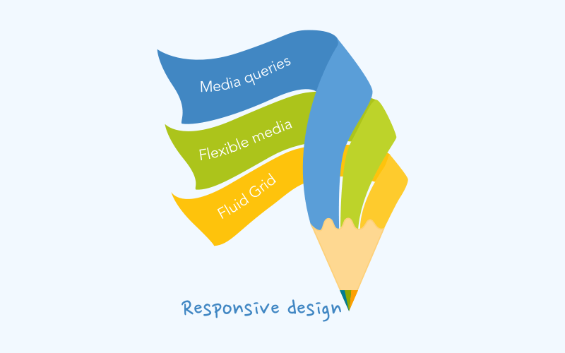
According to this approach, websites must contain such components as flexible layout, media content and media queries.
Flexible layout is applied to various devices and browsers. The content inside changes depending on the screen resolution.
The main focus is in using percents or em. This way, the page changes relatively to browser’s window size. In turn, elements will govern proportionally. For instance, in case a separate column takes 50% of the page in width, it will be the same under any circumstances whether it a desktop or mobile resolution.
Flexible media the content like images, videos etc. This content changes proportionally to the blocks of its placement. However, the content will never become wider of that block (max-width must be applied to all media). This component is a kind of must-have for building a responsive solution.
Media query is a widespread CSS practice. It is used for certain elements optimizations in accordance with screen resolutions. Let’s say, we have 65% width block but during the mobile surfing, it does not look as accurate as you have planned. You decided to reduce this block by 5% for the mobile devices. That is possible due to the media queries.
Summary
This design approach does not really care about devices. As its main aim is in building a page suitable for all devices and using one set of code. In this case, ‘suitable’ does not always mean convenient. Nevertheless, that all depends. This approach is a good choice for the project with a desktop-centric audience or without extra money for the mobile adaptation.
Adaptive design

Another approach to the creation of eye-catching web products is adaptive design. This approach adjusts the design according to the device screen size or browser.
Such notion as adaptive design was firstly used after A. Gustafson’s book publication. The main idea of this approach is in delivering the qualitative UX to those devices where a website is available with no technical restrictions. Using the same technologies as responsive design, this approach will adapt to the width of different devices as well as browsers. However, these two approaches still differ. Web pages which were created with the help of AWD approach will change its structure step by step, while RWD gradually adapts its content in accordance with the resolution. The adaptive design principles are based on multiple layouts creation as well as optimization for predetermined devices or screen resolutions.
This is quite smart because nowadays we have a huge rapidly growing market of smart devices. All of them have different resolutions and the access to the Internet. Accordingly, users can be provided with more convenient content arrangement depending on their devices.
This approach demands the creation of different layouts. This way, before the development stage, you should define your target audience as well as devices which may be used on your website.
Ways to be adaptive
This approach development requires the usage of different strategies. Let’s consider them more closely.
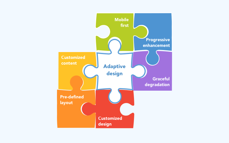
According to the progressive enhancement strategy, you should start your website creation taking into account all the demands needed for the old browser versions. After that, you start optimizing your product for the modern browsers. This way, you will get a qualitative product supporting a wide range of browsers.
One more strategy is called graceful degradation. This strategy’s structure is similar to the previous one. However, to create a qualitative product, this strategy offers you to start from the most modern browsers and then optimize your website for the old ones.
In case, the mobile devices are in priority – you may use the Mobile first principles. This concept is also quite similar to previous ones. Although, it is applied towards the smartphones. The components in this design are placed compact and concise as well as into one column.After the mobile-centric component is ready – the website is being optimized for other devices. Now, you can redistribute the content more conveniently for other resolutions and add some dynamics.
Summary
Web sites which were built in accordance with adaptive principles should contain the following features:
- Content varies depending on the device
- Various templates usage
- Unique design concept for different device groups
It is worth noting that there are many disputes concerning the definition of these two designs. However, according to their origin, the responsive approach consists of a flexible layout supplemented by one HTML markup, at the same time adaptive design provides users with a customized solution with the help of multiple layouts which fits perfectly to a separate group of devices.
Choosing the approach
Which approch you should choose for developing your website. Let’s see.
Responsive development
Pluses
- The presence of only one URL makes promotion easier.
- Responsiveness is welcomed by Google, so it is considered to be SEO friendly.Responsive development is easier for a developer and cheaper for a customer.
- Responsive development is easier for a developer and cheaper for a customer.
Minuses
- Not always good looking on mobile devices (may be overloaded with content).
- Inability to deliver customized solutions for different devices.
Adaptive development
Pluses
- Possibility to build an eye-catching and customized web solution with a focus on the separate type of devices.
Minuses
- Complicated development as well as updating and maintenance.
It is fully your decision. However, before choosing, you should weigh the pros and cons as well as define your target audience. It will help you to choose between these two approaches.

Leave a Reply