Adding mobile menu to genesis theme is an easy task. What you just need is a decent code editor ( for offline editing ) and internet connection for saving the changes.
Well now getting back to our topic, in order to add responsive mobile menu to genesis child theme you will need to edit your theme’s function.php file and have to even add custom CSS codes in order to beautify the default style.
By default genesis does not support mobile menu and this means they are not wrapped into dropdown when viewed from smaller screens.
Contents
Add Mobile Menu To Genesis Theme

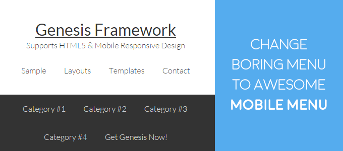
In the above snapshot, you can see how the default genesis theme renders in the Samsung galaxy which is an android powered smartphone.
Here you will notice that navigation bar tabs have piled up one below another. And if the same page is loaded in devices with screen size approximately 250px wide then the complete menu tabs will be pulled horizontally. So it means that now your readers will have to first scroll down and then only they will be able to see latest updates on your blog.
Overall I can say that this design hinders your reader’s eye in mobile screen and can be a perfect cause for high bounce rate in small screens.
Follow The Steps
In this tutorial, we are going to fix this problem. Actually, the complete setup will require merely 10 minutes and your new design will be ready.
It is an extremely lightweight script, which will help to transform the basic menu bar layout into the responsive mobile menu. It uses jquery and custom style.
- Go to SlickNav and either clone the folder to your desktop or download the zip folder.
- Now unzip the slick nav folder. In the folder, you will find the JavaScript and one style sheet. You have to upload them to your theme’s folder.
- Use either file transfer protocol (FTP) or panel to upload these files.
- Now using them create two new folders. First named styles and second js.
- Upload the jquery.slicknav.min.js to js folder and slicknav.css to styles folder.
Step 2: Let’s Add Responsive Mobile Menu To Genesis Theme
If you have uploaded all the required files properly, you can move ahead.
Now you will have to ask your theme to include these files to its HTML structure. In order to do so, we will use WordPress script and style enqueue function.
function wpvkp_script_style_install()
{
    // The function used below will help to include the .js .css file from the folder to theme:
    wp_enqueue_script( 'responsive-nav-script', get_template_directory_uri() . '/js/jquery.slicknav.min.js' );
    wp_enqueue_style('responsive-nav-style', get_template_directory_uri() . '/styles/slicknav.css' );
}
add_action( 'wp_enqueue_scripts', 'wpvkp_script_style_install' );
Let me explain all these functions to you. Over here I am using wpvkp_script_style_install () which is my custom function. Then using the add_action we will register our script and style to WordPress.
These are the basic steps in WordPress theme development.
Now you will notice that I have used wp_enqueue_style and wp_enqueue_script. These two can be considered as a hook. They allow you to import styles and scripts respectively from the provided directory.
Then I have added the direction to the directory via get_template_directory_uri () which automatically call the theme directory route.
You will also notice that I have added responsive-nav-script and responsive-nav-style. These two are the custom names that I have given to my script and style.
If you complete these steps successfully these the required files will be loaded to your theme’s structure.
function wpvkp_script_style_install() {
	wp_register_script ('slicknav', '//cdn.jsdelivr.net/jquery.slicknav/0.1/jquery.slicknav.min.js', array( 'jquery' ),'1',false);
    wp_register_style ('slicknavcss', '//cdn.jsdelivr.net/jquery.slicknav/0.1/slicknav.css','', '1', 'all');
}
Now it is time to inspect your website’s menu area. Since we need the exact head nav class to include it to JavaScript file. After updating the JavaScript, it is time to test your website. Whenever your website’s width will go below 300px, JavaScript will come to action. Then it will load its style sheet and will render the custom js fade effect.
Since we are using Genesis, the primary navigation HTML structure is generally .menu-primary. So considering this we will add the following script to our theme’s function.php file.
After adding this script, you can save your theme’s function file and load your website to see the changes. Now if you bring your browser’s width below 300 you will see your navigation folded into Menu structure.
The Final Result

In the above image, you can see that all the menu components have wrapped up into a dropdown component. You can further edit the style and design of this component as per your need and company’s brand presentation.

Leave a Reply