A logo is the face of a company, its main visual component.
There is no room for superfluous elements, ambiguity, and vagueness in a logo to make the right impression on the audience. It shapes the impression of the product or services, makes the customer remember you, and come back for purchases.
To design a logo, use the Turbologo.
Why does a company need a logo?
Brand identity is understood as all the visual components: a logo is a part of it. It’s the way consumers distinguish companies from one another, make purchasing decisions, remember and recommend different brands. Even local businesses need visual differentiation.
Why bother with a logo at all:
- Customers, partners, and the media identify a company by its visual image. The logo communicates to the public what the company does.
- The identity enhances the effectiveness of marketing. Through a logo, a company shows its values and advantages better than through text. The study Impact of color on marketing found that more than 70% of customers make a purchasing decision solely due to the color of the image.
- A logo helps stand out among competitors and information noise. A quality logo is as recognizable as a face in a crowd.
- A logo is a symbol of quality. When a company’s products or services are accompanied by a visual identity, consumers will identify with the brand. This reinforces ownership by protecting against counterfeiting.
It is possible to develop a logo in-house without hiring a designer, then the service will be free to the company. Price tags in creative studios start at $800 and go up to tens and hundreds of thousands of dollars. But the cost is not the deciding factor for a successful logo and brand going forward. For example, Nike’s recognizable tick was invented for $35, and the Coca-Cola symbolism was drawn for free by an accountant at a then-starting company.
How do you create a logo?
Before you create a logo on your own or with outside help, it’s worth going through a preparatory step. This will help take into account the nuances of the company and develop a quality logo.
- Analyze the company. Answer the questions: what the company does, who the target audience is, how the brand plans to develop, what qualities and values you want to convey visually. This will help you decide on the variant of the logo, the color palette, the images.
- Look at your competitors. Examine your competitors’ visuals for their differences: whether their logo helps them stand out, how it’s executed. It’s important not to be repetitive.
- Draw up use cases. Think about how and where the brand image will be used. An offline business will need signage and print products, for example. And an online store will need to use web colors for website design, social media, and banners. Ideally, the logo is versatile for small and large-scale elements of the identity: a website favicon, a badge on staff clothing, a corporate flag at an event, an Instagram avatar, or a branded pen.
Think in advance about what brand identity elements the logo will use to provide an option for them. - Get inspired by ideas. Look at examples from other companies. Research themed websites, highlight images you like.
- Create several design options. After analyzing the market, company, and competitors, you may have several ideas on how to bring a logo to life. It’s better to fix each of them – for example, draw a rough draft.
Ways to create a logo
By yourself
By yourself, you can create a logo with the help of graphic programs (Photoshop, Figma, Illustrator, InDesign, etc.). Here you have full control over the process, but without experience in design the result may not turn out very well.
Online Service
On online platforms, you can also make a logo yourself, but already in automatic mode. The designer will ask for input data about the company, find out preferences and give the finished result for downloading.
Designer, freelance
With an average budget, you can find a performer – a designer who specializes in logos. He will also request background information about the company, reference images, and ask clarifying questions. It takes about 1-4 weeks to develop. This method is suitable if you have time to find and control a specialist. It will also not be superfluous to understand the basics of design.
Agency
The agency will take care of all tasks for the development of corporate identity. In addition, design agencies provide services for the design of social networks, souvenirs, emails. Anything a medium to large business might need.
But in all of this, the font is just as important.
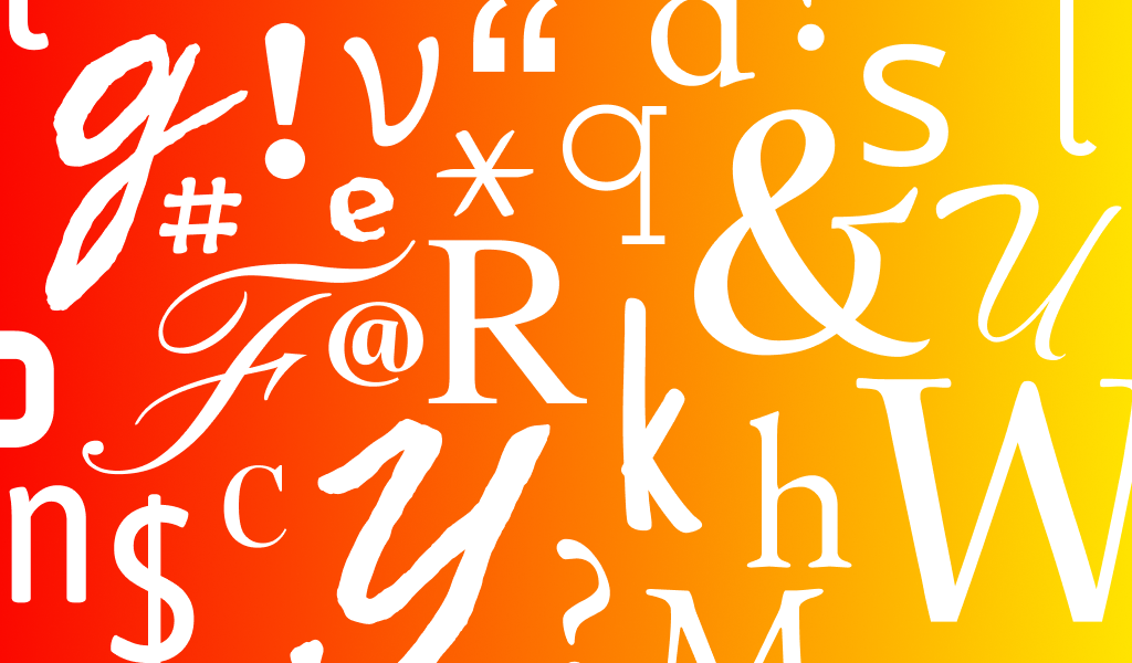
Why is font important?
The font is the handwriting of your business, an important visual element for creating the right perception of your brand. Text is often the main way a company communicates with a client. Using harmonious combinations of fonts on the website, in promotional materials, and in other components of the identity helps to form the image of the company, reflecting its positioning.
What font is used in web design, indirectly affects the conversion rate: visitors to the Internet portal are more loyal to the content presented by readable – clear, and discernible fonts, in which case they are more likely to become regular customers.
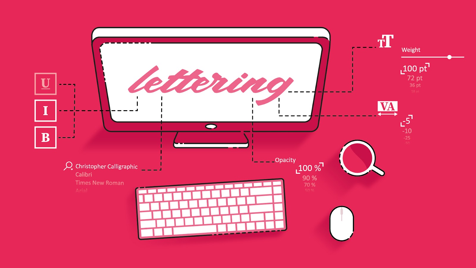
Consider, what is the best font for the site and logo and what might be the criteria for choosing the right font, as well as what good style lettering and when it is applicable.
Popular fonts in 2022
The trends of 2022 are laid-back, non-standard approaches, dynamics, playing with volume and form, strongly pointed or accentuated rounded corners, thick grotesque lines, and authenticity of handwritten fonts. Let us consider them in detail.
Massive letters with wide strokes, act as a “heavy” visual element, immediately attracting the visual attention of potential customers.
Minimalism and modernity – such fonts are characterized by lightness, dynamics, originality, brevity, the use of geometric elements in moderation. For example Codec Pro, Impossible, Nevrada, Cremona, Sofia Font, Black rovers Font, Agnostic Font, QSansPro, Mofita, Munich Sans. They are great for packages, headers, emblems, quote design, menus, but also for business cards, presentations, posters, websites, email signatures.
Retro styles – are always relevant, create a touch of nostalgia, romance. At the same time, they can emphasize the non-mainstream character of the company, time-tested quality or appeal to a certain time epoch, its values, and its mood. In 2022 they are predicted to be especially relevant.
- Decorative graphics with smooth lines in the spirit of the late 19th century, when designers rejected the standardization and uniformity of the industrial revolution, are at the peak of popularity;
- Romanticism of the 60s (the thick flowing curves of letters, typical for movie posters and records of those times – examples: Aesthetic, Curious Type, Big Bro, Groovy, The Banthink) and 70s (bright, neon colors in the spirit of disco) are in trend. Examples: Miami Vice, Alba, Nasalization, Rotola TH Pro, Liberta TA, 8th Avenue, 6th Aniversario;
- Sans serif fonts with a pre-digital feel: Recoleta, Voga, Magfirah, Selvina. Most often found in glossy magazines, presentations, postcards, prints.
Unusual handwritten fonts. Usage is limited to logos and corporate identity materials, but it is a very powerful and relevant tool to convey the mood of the brand and translate an authentic image. By creating a font (or simply lettering) for a specific project, instead of choosing from existing fonts, you are guaranteed to stand out from the mass of “standard” fonts, and the use of a casual handwritten manner and deliberate carelessness adds lightness, swiftness, soulfulness, appeals to the present moment “here and now”.
Fonts with accentuated rounded letters are flowing and soft, or even puffed and puffy, without sharp angles. Such fonts, formerly considered “children’s”, are now also confidently passing into adult projects. Probably, it is connected with the rather depressive public atmosphere of 2020-2021 when cheerfulness, carefree attitude, unproblematic approach – everything that such fonts carry in themselves – became especially desirable.
Fonts with accentuated sharpened letters: clear lines, hard bends, elongated sharp ends of letters, all this is also in trend, because it looks sharp, dramatic, relevant, and in many ways echoes the timeless Gothic.
Volumetric fonts. The volume effect is achieved by using different textures, shadows, combining images of different properties of the surfaces (sand on the stone, flowers on wood, paper applications, 3d fantasy forms, and so on).
Fonts “breaking the rules”: for example, lettering where all the letters are a different size, style, or slant, or the word is read not from left to right, but on a kind of broken diagonal – that is, it looks as unusual and non-standard.
Animated fonts. The theme of volume and irregularity continues with animated moving fonts, which can be easily used in the web environment in logos, headlines, and so on. The designer’s imagination is not limited by any restrictions – what is important is the change itself, the dynamics, and the process of transformation. Before the eyes of the viewer, a font from one configuration changes into another, its shape, style, size, and slope of the letters change, some additional visual effects appear.
Classic and elegance are still universal: Classic Roman™, Galano Classic, George, Chloe are sophisticated and easy to read. Vaguely Fatal Font, Oleo Font, Le Royale, Roihu create a warm, relaxed atmosphere.
Clean graphics are also relevant: Veneer Clean™, Palomino Clean, Papua Font, Mimi Typeface, Fox & Cat look harmonious on logos, packages, business cards, postcards, headlines.
Conclusion
Fonts are what make up the foundation of any logo, it is with this aspect that your successful design of a future emblem and possibly a highly successful business begins. So, if you want your brand to become not just attractive, but also talked about by many people – use the right font.
Leave a Reply