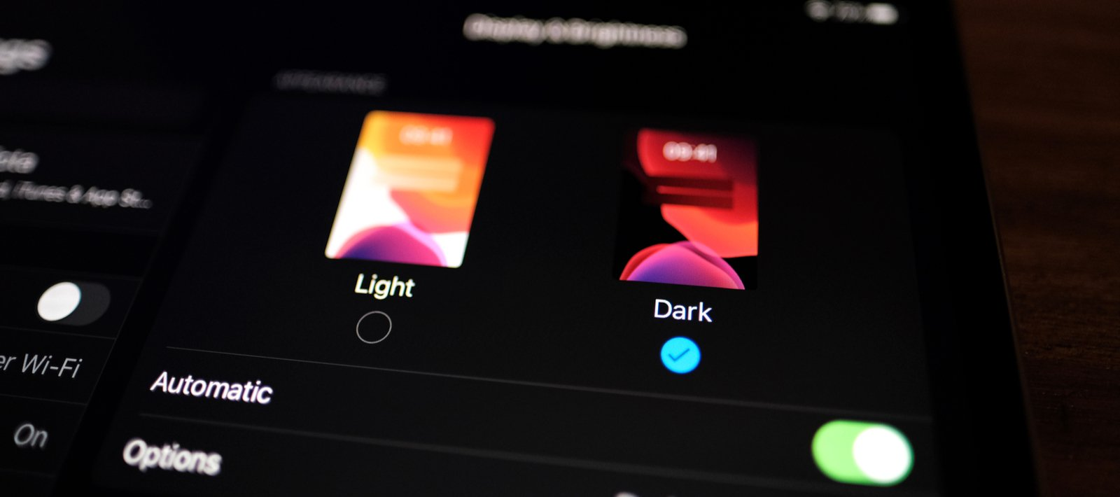
Every day every user visits many sites and this forces companies to try harder and harder to keep users’ attention. The visuals and overall appeal of your website is the road to success. You need to follow trends in interface design in order to be in demand in this game.
Fireart has prepared an article for you on the top user interface design trends in 2021. So let’s get started.
Contents
Minimalism
Every year, minimalism enters our life more and more firmly. This is evident not only in website design but also in the sense of life. A very large amount of advertising is poured onto users every day. They have to receive constant endless notifications about discounts, sweepstakes, new products and more. In addition, they have to look through the proliferation of interfaces, the amount of information on which is simply exorbitant.
To avoid such a negative effect like overloading, web designers have to look for more and more new ways to help simplify graphic elements. It is a constant search for new color combinations, different proportions and compositions.
Functionality is in the first place today. Therefore, it is extremely important to determine what are the best qualities of the product and correctly present them to the buyer through the emotions of using this product. It has long been considered irrelevant to use components only for decorative purposes.
Be as simple as possible
Complex interfaces that force the user to do a lot of unnecessary actions have long been out of trend. Since 2021, designers have been trying to minimize the margins and elements with which the user interacts. We are confident that this trend will transition into the ui trends 2022.
The most recent trend in user interfaces that both users and developers love is the simplified way to sign in and sign up.
This step allows the user to spend less time on initial authorization and registration, which positively affects the attitude and traffic of the website. Now you can log into your account, just enter your mobile number and not remember passwords.
Unobtrusive blurred background
Gradients and the different styles of using them continue to appeal to users and, therefore, developers.
The only change was the lightening of the colors used for the gradient. If last year there were dark transition colors in the trend, today they have become lighter and a little more complex. All thanks to the fact that together 2-3 colors from the palette for linear gradients began to use 10!
Well-known companies are happy to use this trend, because thanks to such a colorful design, users feel a surge of temperament.
Make way for unique illustrations!
Unusual 2D illustrations still hold their ground in the top design solutions for websites. But now they are less common than last year.
If earlier, in order to make the page not seem overloaded and incomprehensible to the user, designers tried to adhere to minimalism in illustrations, now they are boldly experimenting with different styles, angles and proportions.
The use of bright and luscious, or opposite to muted and delicate tones, makes the illustrations more beautiful, which causes a lot of excitement around them.
In order for your illustrations to be enlarged without loss of quality and proportions, we recommend using the SVG format. If you save an illustration in the usual PNG, GIF or JPEG, the image quality may deteriorate significantly.
Sound interface
User interface voicing was already a trend, but as a result of its widespread use among UX / UI designs, it has again become a cool alternative to boring visuals. Who said that a design must be purely visual to work properly?
And although the voice interface is associated with context and data synthesis, rather than design, web designers never cease to amaze us in every way they play with this solution. Now you can see many different applications, both mobile and web applications, which use a voice assistant. It synthesizes your voice and translates it into the information you need.
Using pastel colors
Since minimalism has already become the meaning of life, the use of pastel colors by designers in their works has become a trend. Pastel colors allow you to emphasize the lightness of any design.
Because of the simplicity of pastel colors, they can be incorporated into a variety of designs, as they can set the right atmosphere and tone for a variety of websites. This is suitable for platforms such as e-commerce platforms as well as for a variety of applications.
Landmark for mobile devices
Most of the requests today are made via mobile devices. Users can use their smartphones to search anywhere they want, be it a living room in a house or a cafe in the city center. Find concert tickets, order food delivery, buy sneakers or find a job at the labor exchange, people are constantly looking for something.
Therefore, it is imperative that designs look good not only on the web but also display correctly and look beautiful on a mobile device. That is why it is important not to forget to focus on mobile devices too when developing user interface designs. According to web designers, this is great for improving the interaction with your customers.
Don’t forget about icons!

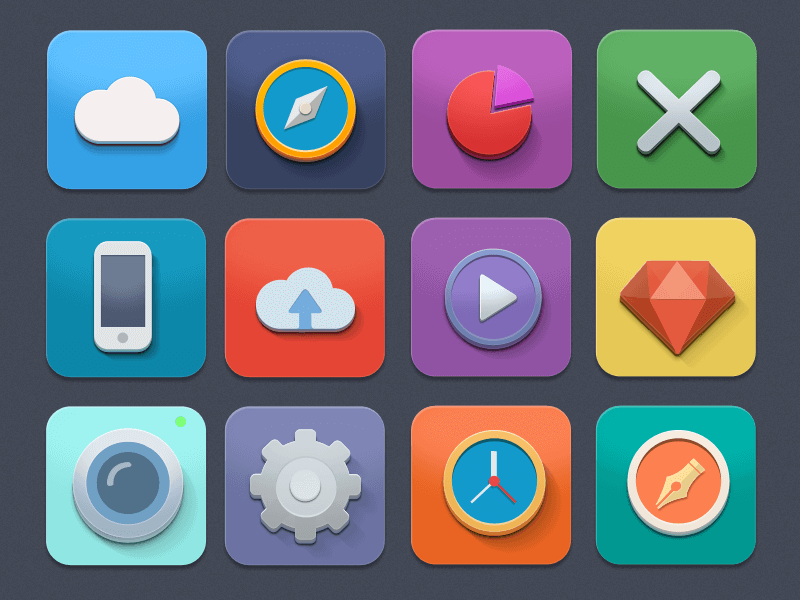
Icons are one of the most important tools for visual communication with the user. Simple and minimalist icons have become a powerful trend now. This happened because of their properties to convey meaning in space, rather than in words.
This is why a large number of companies pay so much attention to their icons. It is worth noting that in 2020, such serious companies as Apple and Sketch completely changed their icons following the latest trends.
For a high-quality visual effect, we advise you to opt for icons from the same family. The shape and size of the icons must be the same. This will demonstrate that you have a high level of skill and generally enhance the integrity of your site’s design.

Leave a Reply